Le Petit System 2.0
Co-led the rebranding and redesign of Le Petit Ballon’s Design System, delivering a cohesive brand and product experience within eight months.
Client
Le Petit Ballon
Year
2024
Team
1 Creative Director
2 Designers (me included)
2 Developers
My Role
Design System Designer
UI Designer
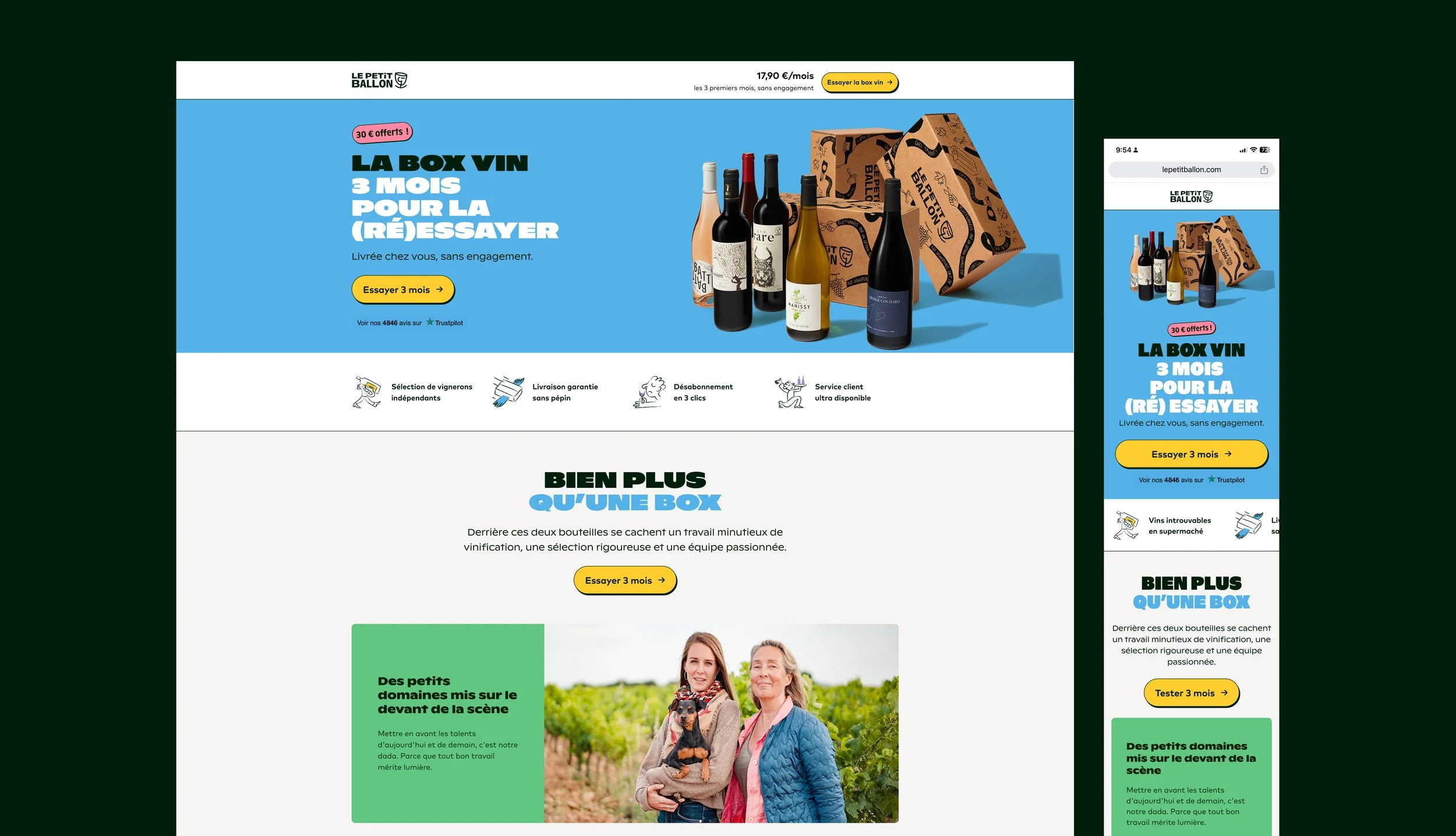
Le Petit Ballon is a French wine subscription and e-commerce platform with two boutiques in Paris, offering an accessible and fun way to discover wine.
Context
I co-led Le Petit Ballon’s rebranding and led the redesign of its Design System, “Le Petit System.” The initiative began as the company had grown rapidly and organically. In less than two years, it had also undergone two different business directions under changing leadership, which directly affected the coherence and scalability of the design system. This project became an opportunity to refresh the brand and simplify the existing system, leveraging the migration from Magento to Shopify.
Objective
Rebuild the Design System alongside the rebranding, redefining visual foundations and product experience. Deliver a full UI Kit update, refreshed foundations and components, and patterns and unify brand touchpoints across physical and digital assets. Advocate for cross-functional collaboration and drive adoption across product, branding, and marketing teams.
Solution
Delivered the new website and rebranding on time, establishing a scalable text style system and cohesive visual language. Placing the product at the heart of the rebrand enabled a holistic transformation across digital and physical touchpoints. Strengthened collaboration between UI, front-end, CRM, and marketing teams, promoting alignment, adoption, and a strong sense of belonging.

Challenge
The main challenge was finding the right balance between function and aesthetics. The previous system felt restrictive and hard to design with. Our goal was to create scalable, accessible styles that reflected the boldness and personality we wanted the brand to express.
Approach
As a team — including the Junior Studio Designer, Print Designer, Creative Director, and myself — we already had a clear understanding of our key issues. The display typography wasn’t meeting our visual or functional needs, which led to low adoption. The color palette had also become overly complex and pastel, softening the brand’s tone. We needed a bolder, more confident foundation that could support both digital and physical touchpoints.
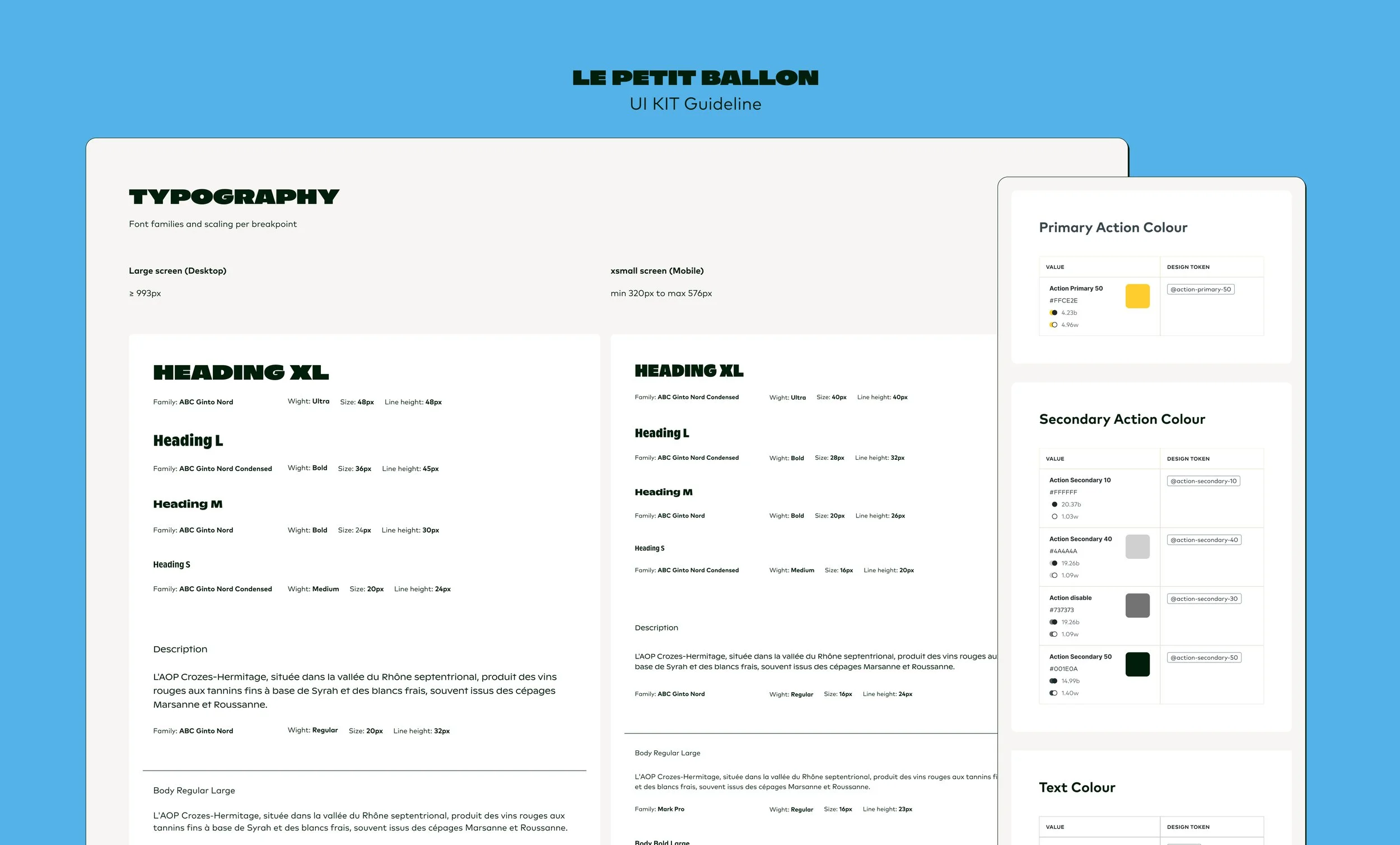
Text Styles
Together with Loïc from Studio Mate, we explored different font families to find one that matched the brand’s voice and functional needs. As a team, we narrowed the selection, and I created text styles to test responsive scales directly in Figma, applying them across multiple layouts to evaluate flexibility, legibility, and hierarchy. Through iterations, we defined the final text styles — from headings to labels — ensuring each size and line height worked seamlessly across breakpoints.
In parallel, as we finalized the text styles, Loïc tested their application across print assets — including the magazine and fiches vin — ensuring consistent typography between digital and physical touchpoints.
Result: After a year of implementation, we only needed to adjust one pricing text style. Also, we have a happy front-end developer who is no longer complaining about detached text styles.
Colour Styles
Our goal was to simplify and strengthen the colour palette while moving away from the soft pastel tones of the previous branding. We reduced 350 colour styles to 46 primitives, establishing a clear and flexible foundation. To increase accessibility and scalability, I restructured the library into primitive and semantic colours. The result was a bolder, more distinctive visual voice and a color system that’s easier to maintain across product and marketing touchpoints.
Components & Patterns
Once the new foundations were in place, I published the updates to the Foundations Library and gradually rolled them out across the Components Library. Instead of updating everything at once, I prioritized components as they were needed — in parallel with the ongoing redesign of website pages and patterns. Most adjustments focused on spacing refinements, mainly due to changes in the new heading styles.

Success
Our biggest success was establishing a solid foundation. While we continue exploring new directions, the core system remains stable.
Accessibility
I used Stark – Contrast and Accessibility Checker to thoroughly verify our design decisions against WCAG 2.1 standards. Every text style and color combination was tested for contrast. This process ensured that accessibility was embedded in the foundation of the system.

Successful adoption and alignment
One of the key drivers of adoption was introducing a weekly ritual called “Designers only” from the very beginning. These sessions became a space to share explorations, raise questions, and discuss design decisions openly. By involving everyone in shaping the new foundations, the team developed a strong sense of belonging, ownership, and alignment around the new system.

Documentation
As a small team, we needed practical documentation. We used Notion to share foundations and guidelines with non-design teams
For the product team, I built a “Goodies” library to document components, patterns, and design–code decisions in Figma. To streamline this process, I also used documentation tools like EightShapes Specs and Claude. As a small team, we needed practical documentation. We used Notion to share foundations and guidelines with non-design teams.
For the product team, I built a “Goodies” library to document components, patterns, and design–code decisions in Figma. To streamline this process, I also leveraged documentation tools like EightShapes Specs and Claude.

Achieved a +20 % improvement in text style consistency
+33 % boost in color consistency.
Achieved a +20 % improvement in text style consistency +33 % boost in color consistency.
Results
Adoption: Designers quickly adopted and used the system fluently.
Autonomy: Non-design teams gained independence in building and maintaining visual assets.
Integration: The system was integrated into the CRM platform for mailing communications, and a social media library was created to stay aligned with the Design System.
Efficiency: Improved workflows and reduced friction between design and engineering teams.
Cohesion: Strengthened visual and editorial consistency between the magazine and the website.
Learnings
On the product: It worked because the product was placed at the heart of the rebrand. It allowed us to achieve a holistic and consistent transformation.
On the organization: The Design System became the driving force behind a broader shift in team structure and workflows.
Personal takeaway: It doesn’t have to be perfect — what truly matters is adoption.